https://magic.piktochart.com/output/22025232-q4
Showing posts with label post-production. Show all posts
Audience theory relates to
how the audience respond to and interpret any given text. The media audiences
can be defined in terms of location, consumption, size and subjectivity.
Depending on the audience, they may interpret our A2 teaser trailer, a psychological
horror on 4 protagonists who are psychologically damaged in different ways. Our
teaser trailer is aimed towards people over 15 years as a US-style blockbuster
film. Halloran, suggested that researchers should shy away from thinking “what
media do to people”, and instead replace it with “what people do to media”,
which links in with the idea that there are two types of audiences, active and
passive. If the audience is passive, they receive unmediated messages from the media
that heavily influences them, whilst an active audience is aware of the media
and they are in control of what they consume from it.
In our trailer, we chose to explore this through the perceived glorification of violence by the main protagonists. To do this, we decided to have two costumes, both of which have signifiers of urban youth. One costume, features light coloured, urban-style tops and jackets, whilst the other, features dark coloured, torn, ripped t-shirts, jeans and masks.
In an establishing shot, we see two of our protagonists breaking the 4th wall by staring into the camera in an extreme close-up shot, as if to intimidate the audience, adhering to the stereotypes propagated by the media about reckless youth. Additionally, our choice to have two costumes emphasises that, to the protagonists, violence and murder is almost like a game, and that it’s almost ‘trendy’ to be this unruly in society.
We highlight this again by having a close-up shot in high key lighting of blood running upwards of a hand, then several handheld mid-shots of the protagonists spinning mindlessly in the forest, dancing near the waterfront, their outlines illuminated by the city lights and extreme close-up handheld shots of the protagonists laughing into the camera. Moreover, we used a VHS style glitch over the shots to suggest that they are being watched, and that they enjoy displaying their unruly behaviour, stressing that this type of behaviour may be replicated in youths of that age.Media texts are all representations of reality, intentionally mediated so that they are perceived in a specific light intended by their producers. Representations are also dependent on the media, as without them, our perception of reality is limited. Therefore representation is a fluid, two way process, which can relate back to our A2 teaser trailer, about four psychologically damaged people dealing with their compulsion to wreak havoc on their society.
David Gauntlett argued that identities are not given, but constructed and not negotiated. In our trailer, we decided to construct two identities for each of the 4 characters, the ‘normal’ persona, which is deemed acceptable in society and the ‘crazy’ persona, which is violent and dangerous. We do this through our use of costume; in the opening shots of our trailer, two protagonists wear lighter coloured, urban style clothing to present them as young teenagers who are comfortable in their environment. 
Towards the end of the trailer, we dressed the protagonists in darker, torn, ripped clothing and reddened scars to visually signpost that as they become more violent (demonstrated by high angle extreme close-ups of blood running upwards of a hand, and eye-level extreme close-ups of bloodied screwdrivers), their previous identity is increasingly merged. Moreover, we present the protagonists as enjoying the damage they inflict on others, whilst they’re in their ‘crazy’ persona. We do this by showing the protagonists laughing and dancing by the darkened waterfront, illuminated by Canary Wharf’s lights in a mid-shot, and by a low angle extreme close-up of one of the characters laughing down into the camera.
Following our research on film websites, we decided to go with the aesthetic of the 'Moonlight' website, as well as having cool effects like the Inception website. Our website forms the 3rd and final part of our production package.

It was important that our trailer play immediately after opening our website, much like the Inception one, so that visitors won't have to click around for the trailer to play.
In the background of the home page, there's a 30-second mini-video we edited, which include different scenes that we didn't use in our final trailer. Then we used our VHS style glitch over it to keep the background the same as our teaser trailer.
The title, much like Moonlight's website, takes up the centre of the page, with the same neon-blue font we used in our trailer. Additionally, we decided to change the default font in Wix, to a font that looks visually similar to ours for our Home, About and Contact pages.
Our Tagline: 'Everyone has a crazy side' sits directly underneath the title, and is the same colour as the tagline seen at the top of our poster.
Our 30 second video also had sound, and we manually added the VHS sounds manually by converting our mini video into mp3 and adding it as a widget that can be turned off and on.
When you scroll down, there's a reel of 3 movie reviewers, which also appear in our trailer. We used the visually similar font in neon blue and white, in keeping with the colour scheme of our trailer and poster.
Most film websites that we researched also had their film poster(s) available, so further down the home page, we decided to place our poster in the centre, leaving small grey borders on the sides. This is separated by an animated clip of water moving. This was part of the default clips on Wix, but we felt like it suited our trailer, since the Waterfront location features a lot in it.
At the very bottom of the page, we've written about all our production. who was in charge of what, and left our contact details (email, a fake phone number) to our website.
On a separate 'About' page, we've written a shot synopsis about our film and what it's about, using the same font that is on our main home page, to keep our promotional package the same.
Down below is a link to our website.
Switch Official Website

It was important that our trailer play immediately after opening our website, much like the Inception one, so that visitors won't have to click around for the trailer to play.
In the background of the home page, there's a 30-second mini-video we edited, which include different scenes that we didn't use in our final trailer. Then we used our VHS style glitch over it to keep the background the same as our teaser trailer.
The title, much like Moonlight's website, takes up the centre of the page, with the same neon-blue font we used in our trailer. Additionally, we decided to change the default font in Wix, to a font that looks visually similar to ours for our Home, About and Contact pages.Our Tagline: 'Everyone has a crazy side' sits directly underneath the title, and is the same colour as the tagline seen at the top of our poster.
Our 30 second video also had sound, and we manually added the VHS sounds manually by converting our mini video into mp3 and adding it as a widget that can be turned off and on.
When you scroll down, there's a reel of 3 movie reviewers, which also appear in our trailer. We used the visually similar font in neon blue and white, in keeping with the colour scheme of our trailer and poster.
Most film websites that we researched also had their film poster(s) available, so further down the home page, we decided to place our poster in the centre, leaving small grey borders on the sides. This is separated by an animated clip of water moving. This was part of the default clips on Wix, but we felt like it suited our trailer, since the Waterfront location features a lot in it.At the very bottom of the page, we've written about all our production. who was in charge of what, and left our contact details (email, a fake phone number) to our website.
On a separate 'About' page, we've written a shot synopsis about our film and what it's about, using the same font that is on our main home page, to keep our promotional package the same.
Down below is a link to our website.
Switch Official Website
Here is our finished poster, the second part of our promotional package for our teaser trailer, Switch.
In Adobe Photoshop, We decided to go with our second idea, and distort the faces of our main characters to physically show the fluctuation between their persona and shadow personalities (Jung)
The title takes up 80% of the top centre of the poster, to really grab the attention of any viewers. In order to be consistent with our trailer, we used the same typography for our title, and a distorted grey font for our reviews.
The social media links, Facebook, Twitter and Instagram are in the bottom left corner, and coloured dark blue, as well as the production companies, which are in the opposite corner.
The date of supposed release is also in neon white, to make the audience aware of when the film is supposed to be released.
The background is also not solid, it is a gradient from very dark blue to grey, so that the characters can stand out from the background.
At the bottom of the poster, the 15 rating is the only bright red object on our poster, which should draw attention to those going to watch it. It also indicates that the film, if it were released, is available to people 15 years and older, as is true of many psychological horror films.
![]() |
| This is the photo of Virginia that is present on the poster |

Following on from our research of film posters, we decided that we should adhere to the conventions of a typical psychological horror film poster, which usually involves a close-up or an extreme close-up of the protagonists in an extreme range of emotions.
Additionally, we decided to go to the dark photography room in school, to have a mini photoshoot, and take several shots with my camera, so that we had a range and we could choose the best ones to feature on our poster.

As we want to keep close to the aesthetic of our trailer and website, we experimented with different types of shots, and included a photo which only had the red photography light as a back light, which created an interesting effect, but Senem's facial expression wasn't seen clearly, so we opted for the other photos, with the flash.
Overall, the photoshoot was successful as we managed to get a few photos, and we've decided to re-create that hazy, glitched look using our skills in Adobe photoshop
![]() |
| Photo 3 |
![]() |
| Photo 4 |


https://www.surveymonkey.co.uk/r/C3KLWGGHere we've conducted a survey to find out what our target audience thinks about our teaser trailer, as a way of rounding up our post-production
With this, we can assess and evaluate what we did to adhere to our chosen genre and what we can do better if we were to do the project again.
All of our target market agreed that our tailer is linked to Psychological Horror, with some of our target audience's favourite aspects were the montage editing, the sound and typography.
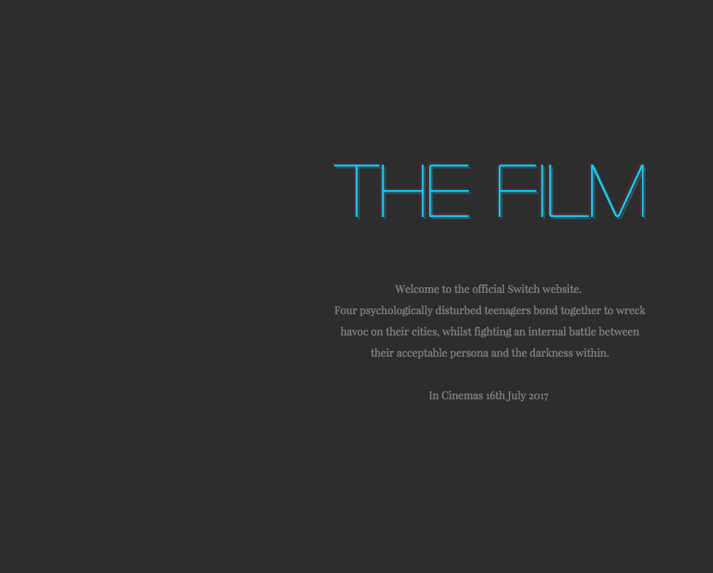
To ensure that our production package is done to a high standard, we decided to look at some promotional film websites, to understand how this adds to the post-production aspect of making a teaser trailer. Below, we've deconstructed the features of film websites which are either visually similar to our teaser trailer, or the same sub-genre of Psychological horror.
Gone Girl (2014)
* With the title being the biggest typography seen on the page, It is also quite interesting to note that it disappears behind a cloud, emphasising the content of the title. The colour of this also matches the very faint picture of the "gone girl's" eyes, a very dark blue/ grey
* The colour palette of the site are pretty much the same, dark blues, greys and light yellows, with the only stand out colour being the Fox news logo
* The husband, is the centre part of the title page , and is almost distorted at the legs by the news band.
* The colour palette of the site are pretty much the same, dark blues, greys and light yellows, with the only stand out colour being the Fox news logo
* The husband, is the centre part of the title page , and is almost distorted at the legs by the news band.
*In the background, an enlarged image of the woman's eyes can be faintly deciphered, possibly implying that the disappearance has something to do with the man placed in the foreground.
*20th Century Fox is the production company, and this can clearly be seen in the top left hand corner
* The actual trailer, however, is placed below the title page, and doesn't play automatically. It takes up nearly all of the screen space
*Underneath the trailer, there is 3 buttons for social media sites such as Facebook, Twitter, and Google plus.
*On the furthermost page, there is an alternative film poster which matches the same layout as the website, plus additional promotional ideas such as The "Amazing Amy" iBooks.
*The theme is quite basic, but because of the size of the video players and other medias, your attention focuses more on that than the background.
Moonlight (2016)
* The title "Moonlight" is placed entirely over the protagonists' faces in bold white typography, which stands in contrast with the neon coloured background
*It then changes to black typography as you scroll down the page, which is an interesting graphic that we can be inspired by.
*The tag line can be found on the top right hand corner, and directly below, there are social media links to Facebook, Instagram and Twitter.
* The trailer itself is not on the website, rather, it's linked to an external page.
*The production company, A24 is seen at the top left hand corner, just like the Gone Girl website
*When you scroll down further on the page, it has some about information in the same black/white theme that the home page changed into.
*On the sides, there are reviews and an Academy award nomination
Inception (2010)
*the trailer immediately plays once you click onto the website, which is exactly what we need to do for our film trailer
*The title of the movie takes up 1/3 of the homepage, in dark crimson red - which keeps inline with the movie's subgenre
* directly below, there's a link to Facebook, and the Inception promotional page on that platform.
* When going past the trailer, you see the alternate home page, which is the movie's promotional poster!
*The main colour palette is dark, cold blues, which is sharply juxtaposed with the crimson red of the title.
*The title is tilted, depicting elements of the narrative, which explores different dream worlds. The fact that the road appears to go 90 degrees upwards also emphasises this
*Leonardo DiCaprio is placed in the centre of the page, emphasising that he is the unique selling point.
*The page is interactive, so clicking on the menu links makes the background move accordingly, which is very visually attractive.
*Different links on the website provide a synopsis of the movie, like this one
*These links are also interactive, and include other videos and promotional social media
Split (2017)
*Social media icons for Facebook, Twitter, Instagram and YouTube are at the bottom of the page, implying that they also have promotional pages there.
*The trailer itself is not on the promotional website. It is externally linked
*Although the trailer is visually interesting, the opening page isn't as eye-catching, which is a problem wer need to consider when me create our website.
* Further down the screen, there are alternate film posters for the movie.
*Hashtags like #split are used on Twitter as another form of promotion, something that we'd need to consider when making our website.
Poster Deconstruction
JACOB'S LADDER
- The text at the top documents that the director of Jacob's Ladder has produced another famous movie, Fatal Attraction, which should attract the same target audience. This is all in white capitals against a plain black background so that it can be visible.
- Most psychological thriller movies have posters which focus very closely on the face, with very sharp precision to see every bit of emotion portrayed by the actor. This, however subverts that, as the sole focus of the poster is a blurred/smudged picture of the main protagonist appearing to scream. This is layered with soft colours like pale grey with elements of blue/purple to appear ghostly or other worldly. The fact that this face is the only object within the poster should draw interest from an audience who like psychological thrillers.
- The accompanying tag line gives the audience some clue as to what the movie is about, but without giving too much of the plot away, which is important in drawing interest.
- The title and the 'Coming soon to a theatre near you' line at the bottom is blood red, which conveys a sense of danger, death, warning and hazard, implying that there might be some form of violence in the film, which is again emphasised by the face.
- The black background may be simple, but when it surrounds the face, it aids the tag line in the assumption that Jacob's 'nightmare' is all consuming, ominous.
- In pale grey typography, the cast, crew and production companies are written, to tell the audience which production company is distributing it, and what time the movie is to be released.

The Skeleton Key
- The Unique Selling Point in 'The Skeleton Key' is the actress Kate Hudson, whose name is in light beige capitals, across approximately 80% of the top of the poster.
- This poster is an extreme close-up of an eye, which ha an incredible amount of detail, from hair to eyelashes, which should make the target audience unnerved.
- the colour pallette of this poster is skin colours, and pale green in the centre of the eye.
- The eye itself is a mirror of a man in a wheelchair facing a house, which gives little hints for what the narrative is about.
- The typography for the poster is shaped like a key for the e letter, which gives a
- The eye takes up the entirety of the poster, which dwarfs everything in comparison, including the title, suggesting that an antagonist is omnipresent, or always watching the protagonists.
- The production companies lines are very small, and positioned at the bottom, which brings more emphasis to the centre of the poster. However, the date of release is in a larger font because this is a good marketing technique for telling the consumer the date of release.
Labels Cloud
- audience
- Carl G Jung
- character
- conventions
- critical theory
- death stranding
- deconstruction
- director
- evaluation
- feedback
- film poster
- film ratings
- filming
- font
- genre
- hand
- head
- hideo kojima
- i saw the devil
- inspirations
- institutions
- James F. Iaccino
- kim jee-woon
- korean
- location
- mise-en-scene
- moodboard
- music
- Narrative arc
- neon
- outfit
- pitch
- post-production
- poster
- pre-production
- production
- props
- psychological horror
- quentin tarantino
- questionnaire
- reflection
- research
- senem
- shanette
- Shutter Island
- story
- storyboard
- subgenre
- survey
- Tate Taylor
- teaser trailer
- The Girl on the Train
- the hateful eight
- typography
- video game
- virginia
- website
Blog Archive
Powered by Blogger.
Popular Posts
-
Natalie Portman as Nina Sayers Black Swan (2010) A “psychological thriller” is a thriller sub-genre that focuses on the unstable emotio...
-
Psychological Horror Psychological horror is a subgenre of horror fiction th...
-
Whilst looking for the aspects of our preferred genre, we found some critical theory based on Jungian Archetypes in Horror films by James...
-
In a Psychological thriller/Horror, sound, diegetic and non diegetic, is very important, as it is used mainly to increase tension or amplify...
-
Audience theory relates to how the audience respond to and interpret any given text. The media audiences can be defined in...
-
Media texts are all representations of reality, intentionally mediated so that they are perceived in a specific light intended by their pr...
-
Shutter Island is a 2010 American neo-noir mystery psychological thriller film directed by Martin Scorsese , based on Dennis Le...
-
TEASER TRAILER Teaser trailers are made with the intention to pique the audience's interest and gain hype before the release of the f...
-
Filming schedule: *Day 1: 11am-3pm (not waiting until dusk) - Virginia and Shanette were at Waterfront, then joined by seem at Greenwich ...
-
The Girl on the Train The Girl on the Train is a 2016 American m ystery thriller drama film directed by Tate Taylor and wri...


