SVS

  • Home
  • Drop Down
    • Deconstructions
    • Students
      • Senem
      • Virginia
      • Shanette
  • Mega menu
  • Download
RESEARCH ON FILM POSTERS

Whilst researching existing film posters in our genre, we accumulated a list of things that seem to be essential in terms of creating the most "perfect" professional poster:
Image result for psychological horror film poster
- Genre
- Main characters involved
- Recurring symbols
- Release date
- Rating
- Social media
- Credits
- Website
- Title 
- Strong, well suited typography 
- Production companies
- Narrative is hinted

It is our aim to make sure all of the factors above are met in our poster, and to the highest standard possible. The posters we researched that had all/ the majority of the list included, the more fascinating and entertaining it was to observe. So to make sure we get a similar reaction from our target audience, our poster must have a lot of tiny but imperative details to create an overall great film poster. 
0
Share

Poster Deconstruction


JACOB'S LADDER


  • The text at the top documents that the director of Jacob's Ladder has produced another famous movie, Fatal Attraction, which should attract the same target audience. This is all in white capitals against a plain black background so that it can be visible.
  • Most psychological thriller movies have posters which focus very closely on the face, with very sharp precision to see every bit of emotion portrayed by the actor. This, however subverts that, as the sole focus of the poster is a blurred/smudged picture of the main protagonist appearing to scream. This is layered with soft colours like pale grey with elements of blue/purple to appear ghostly or other worldly. The fact that this face is the only object within the poster should draw interest from an audience who like psychological thrillers.
  • The accompanying tag line gives the audience some clue as to what the movie is about, but without giving too much of the plot away, which is important in drawing interest.
  • The title and the 'Coming soon to a theatre near you' line at the bottom is blood red, which conveys a sense of danger, death, warning and hazard, implying that there might be some form of violence in the film, which is again emphasised by the face.
  • The black background may be simple, but when it surrounds the face, it aids the tag line in the assumption that Jacob's 'nightmare' is all consuming, ominous.
  • In pale grey typography, the cast, crew and production companies are written, to tell the audience which production company is distributing it, and what time the movie is to be released.


The Skeleton Key


  • The Unique Selling Point in 'The Skeleton Key' is the actress Kate Hudson, whose name is in light beige capitals, across approximately 80% of the top of the poster.
  • This poster is an extreme close-up of an eye, which ha an incredible amount of detail, from hair to eyelashes, which should make the target audience unnerved.
  • the colour pallette of this poster is skin colours, and pale green in the centre of the eye.
  • The eye itself is a mirror of a man in a wheelchair facing a house, which gives little hints for what the narrative is about.
  • The typography for the poster is shaped like a key for the e letter, which gives a
  • The eye takes up the entirety of the poster, which dwarfs everything in comparison, including the title, suggesting that an antagonist is omnipresent, or always watching the protagonists.
  • The production companies lines are very small, and positioned at the bottom, which brings more emphasis to the centre of the poster. However, the date of release is in a larger font because this is a good marketing technique for telling the consumer the date of release.


0
Share
Psychological horror and thriller movies have several similarities in their poster designs; a minimalist design focused on expressing emotion and ambiguity rather than direct messages from the film itself. Such movies that explore the way in which the mind works attract their audience through the visual aspects of their film and the macabre influence of the genre.
Most, such as A Clockwork orange's poster, focus primarily on faces in order to convey such emotion, although some rely on continuous imagery (the glass of milk) that appears throughout the movie to act in place of a tagline. A visual stimulus such as this will be engraved into the audience's minds both before and after they watch the film, and will thus remain an iconic reminder to the movie itself, wherever they may see the reference (even outside of the screen). 
A Clockwork orange in particular draws attention to the title itself and Alex' face by having the two items in a dark background. His harsh black, yet iconic false eyelash beneath his right eye is also another significant reference that any occult movie fan today will understand, thus playing o the idea of subtle yet iconic imagery. Stanley Kubrick's (Space Odyssey) name has also been used here as a unique selling point for the film, as his films are renowned to be some of the best of the best. The expression on Alex' face gives off a sinister yet playful look which will remain in the audience's minds for a long time to come.

0
Share
FILM POSTER DECONSTRUCTIONS

In terms of designing our film poster, we decided to first research existing examples that were of our genre. Typing in 'Psychological Thriller/Horror' made it clear that the main focus on the film posters are of the face/human body. Here are two main examples that stood out for me, that we can definitely take inspiration from for our own film poster. 

    Image result for psychological horror film poster


  • The prominent colour to this poster, and most of the posters within our film genre, is black/dark grey/white. This makes any bold colours (in this case red) stand out and become the focal point to the audience. Red in this case, especially as it is linked to the female, infers danger and passion to the audience, so anyone intrigued by what that would entail in the film can find out by watching it.
  • The couple take up the majority of the poster, highlighting that they will be the main part of the film.
  • A catchy/interesting tagline is found at the top of the poster to draw attention and make the audience wonder what the film will be about- it makes them think.
  • There is a compelling nature as the intriguing light surrounding them, as well as the bold title, draws people in.
Image result for psychological horror film poster


  • Again, the prominent colours found are dark blacks/greys/greys, which is evidently the most used colours for our film genre.
  • The face is the focal point- telling the audience who the main character is, making them aware of the film's 'trademark' and therefore making the film more recognisable. 
  • The unsettling typography and reviews provide an ominous and eerie tone, highlighting the emotions the audience will endure whilst watching the film.
  • A tagline is also found in this poster at the bottom of the poster this time, both placing are still as effective.
0
Share

Friday 9th December- Filming day 5


* Today was our 5th filming day. We returned back to our tunnel location to re-do our 4th film day shots.

*Here, everyone looks more united as an image, since Olivia's new mask fits more with the character's persona/shadow personality.


* Took a long shot of all 4 characters in the tunnel, did this about twice to gather extra footage to edit and play around with.


* Olivia's mask here is much more appropriate to her character than the bag that we had last time. Took a hand held shot with Olivia positioned to the right of the camera's view


* Also attempted to position the camera as a character, took several shots of this.


*Re- did Olivia's running shot from the end of the tunnel towards the camera. Did this as a long shot- to extreme close-up twice.


*Whilst re-shooting, we decided to go back to the Greenwich waterfront location from our first filming day. We also wanted to go just before it became dark, so that we could get some really cool shots of Canary Wharf against the water!

* Luckily we made it in time to catch the skyline at dusk, so we got several establishing shots of Canary Wharf  and the lights against the water .


* We tried out different angles of the waterfront and we decided that we should frame all of Canary Wharf and the water, as that looks the best.


* We also got long shots of all 4 characters doing some random things around the waterfront, which should make an excellent addition to the rest of the trailer


*Having this location at day and night is quite poignant, as it does reflect the difference between the persona/shadow dynamic within the characters.


Overall, today was a successful re-shoot!


Monday 9th January 2017- Filming day 6

*Today was our 6th and final filming day. This location was at Shanette's garden to save time. Today these shots were done at sunrise, to depict a murder investigation.


*Took a panning shot of the back of the garden with the light coming through on the left, gradually gets darker whilst turning away.


* Took a 360 degree, hand held Birds eye view shot of some police line tape, to depict a crime scene. Did this shot 3 times to choose which one will be the best.

*The wind picked up at this point, so it looks as if the tape has been blown away
* Took close-ups and extreme close-ups of the props that I created. This was to demonstrate the danger of the group , which results in death of innocent people.


* Took an extreme close-up of the head. Started from the eye and gradually moved upwards to make the camera act as a character, which worked quite well. The darkness of the shot at the beginning allows the audience to be held in mystery before being very quickly revealed when the light comes through.


0
Share

Diagram looking at the hands and the wrists.
Last year, I made a prop head out of terracotta clay in order to portray myself as decapitated. This year, to improve my skills, I decided to make a head and a hand focusing more on the actual structure of the human body rather than just moulding features on to. For the hand, I had a look at the structure of a human hand, and how it works with the muscles. To recreate this properly, I decided to use straws, string, terracotta clay wax and acrylic paints. In psychological horrors and thrillers, it's more likely that any kind of violence won't be outwardly shown.
in a Psychological horror, the action is likely to be shown, even if it's for a short while, whereas with psychological thrillers, it usually depends on the audiences' perception of the killing, and it's more often than not , that the death will not be shown; Psychological thrillers focus more on the effect on the mind. For our trailer, we've decided to replace all the running shots of Olivia's character with little snippets of the head in a crime scene, to show the danger of the group to society as a collective.

Creating the hand, first using straws to replicate bone structure.
 I then used string through little sections in the straw to replicate the tendons. After this, I added some terracotta clay in small balls to replicate knuckles, and from there create fingers. Keeping the whole thing from drying out before it was too late,was important, as the wax won't hold anything else after it's complete. Finally, I created fingernails and little veins to add more realistic features and painted it with brown acrylic paint. At the end, I put the prop hand into a glove, to depict that the person who died was of some sort of profession. The total creating time for the hand was 3 days.

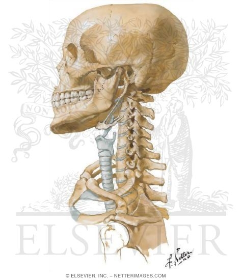
Diagram of the human skull and neck bones (vertabrae)


This is Sunantha, the girl I'm modelling my prop on.


Beginning of creating the prop head. Instead of starting just from the base, I created lots of bone structures in order to really get the facial structure right before starting on facial features. Starting from the nose, I then went on to create nostrils, the cupid's bow, the base of the eye and the eyelids with terracotta clay. In order to keep the head from drying, I immersed the unfinished head in water, then wax and kept it in a plastic bag. 


Creating the prop head. As a continuation from when I first started, I went on to add the Irises, the eyebrow, the ears, the back of the head and the neck. With the neck, in order to show some progression from last year, I experimented with creating a vertebrae, to give the impression that the victim's head was sawn off , rather than cut off. This was much harder, as some of the pieces couldn't hold against the main head, but I managed to fix this with some sewing thread. After using wax on the almost-completed head, I used acrylic paints to finish off the head, and then gave it some hair. The total time to create the head was 5 days, meaning that the total time to create the props this year was 8 days, instead of 2 days last year.


Finished product :)


0
Share
NEON TYPOGRAPHY

Whilst debating on what kind of typography/font we would use for our trailer, we dug throughly into a wide range of trailers in search of finding something different and unexpected. Coming across the trailer of 'The Monster' introduced us to the idea of boldly coloured letters for our reviews and title. The bright pink contrasted beautifully with the dark background; the letters stood out and the title became easily remembered. 

From this discovery, we decided to ponder deeper into more trailers who used bright/neon colours and fell in love with the idea of it. The trailers below were our main source of inspiration for our own trailer.

INHERENT VICE

Inherent Vice was the trailer that made us aware of using neon letters against a bright daylight background, considering in 'The Monster''s background colour was black dominated. This helped us be certain that with our shots that are not in darkness, the neon lettering can still be effective.


THE NEON DEMON


The Neon Demon focused more on having neon objects in their shots rather than the font being neon; it was more like 'The Monster' with being brightly coloured rather than complete neon. Regardless, it was still a solid piece of inspiration to use to take on board with our own trailer in terms of colour choices and placing.


DRIVE

Drive's trailer did not include neon typography, only in the advertisement did neon dominate the pictures entirely. Again, this gave us ideas of what the best colours of neon are to use; and gave us clarity that choosing neon is the best idea for our trailer. Neon really does evidently make everything stand out and hopefully will leave our aimed target audience to be fascinated and intrigued with what our trailer will involve of.


0
Share
EXTRAS OUTFITS

PRELATE

The character of Prelate symbolises insanity mainly in his persona rather than violent actions. Compared to Virginia and I's character, he is more strange and eerie in his behaviour. However we did not want his outfit to reveal a lot about his character- his actions would reveal it instead. So, we decided that it would be best if Prelate wore a 'normal' outfit so that members of the public would be deceived into thinking he is one of them, when the audience know that he is very different. 


OLIVIA

 
Olivia's character, as shown in the mood board blog, is fond with feline traits. To support this, we thought it'd be best for her to wear a cat onesie. It is also convenient that the onesie is dark coloured to give negative connotations to her character.


The mask is the main aspect of her outfit- the dark colours with the static vibe of the mask radiates a sense of danger and violence. Having a mask shows that her identity is preferred to be hidden to completely separate her normal self to her alter ego. Placing the two together (mask and onesie) is a strange mix and would therefore be unsettling and disturbing for the audience as it infers her character to be quite unpredictable and capable of inhumane acts. 


0
Share
Newer Posts Older Posts Home

Labels Cloud

  • audience
  • Carl G Jung
  • character
  • conventions
  • critical theory
  • death stranding
  • deconstruction
  • director
  • evaluation
  • feedback
  • film poster
  • film ratings
  • filming
  • font
  • genre
  • hand
  • head
  • hideo kojima
  • i saw the devil
  • inspirations
  • institutions
  • James F. Iaccino
  • kim jee-woon
  • korean
  • location
  • mise-en-scene
  • moodboard
  • music
  • Narrative arc
  • neon
  • outfit
  • pitch
  • post-production
  • poster
  • pre-production
  • production
  • props
  • psychological horror
  • quentin tarantino
  • questionnaire
  • reflection
  • research
  • senem
  • shanette
  • Shutter Island
  • story
  • storyboard
  • subgenre
  • survey
  • Tate Taylor
  • teaser trailer
  • The Girl on the Train
  • the hateful eight
  • typography
  • video game
  • virginia
  • website

Blog Archive

  • ▼  2017 (16)
    • ►  May (3)
    • ►  March (2)
    • ►  February (3)
    • ▼  January (8)
      • What Makes Up a Film Poster
      • Poster deconstruction
      • Psychological Film Posters
      • Existing Film Posters Deconstruction | inspiration
      • Re-shoot (Filming day 5 & 6)
      • The making of the props
      • Neon typography
      • Extras Outfits
  • ►  2016 (31)
    • ►  December (3)
    • ►  November (7)
    • ►  October (15)
    • ►  September (6)
Powered by Blogger.

Popular Posts

  • Character/Archetypes of Psychological Thriller/Horror
    Natalie Portman as Nina Sayers Black Swan (2010) A “psychological thriller” is a thriller sub-genre that focuses on the unstable emotio...
  • Psychological Thrillers and Horrors Moodboard
    Psychological Horror   Psychological horror is a subgenre of horror fiction th...
  • Character Moodboard [1]
    My character's general looks fall under the 'Skinhead' aesthetic; a title given to an early punk style of clothing in Britain...
  • Existing Film Posters Deconstruction | inspiration
    FILM POSTER DECONSTRUCTIONS In terms of designing our film poster, we decided to first research existing examples that were of our genr...
  • Character Moodboard [2]
    This character is for our actor Desire. This moodboard encompasses the idea that the reason this character begins to have violent outburs...
  • Narrative Arc Moodboard
    This is our initial Narrative Arc from our pitch. this outlines what we basically want to do , if our project was a full scale movie. H...
  • Sound and Music in Psychological Horror
    In a Psychological thriller/Horror, sound, diegetic and non diegetic, is very important, as it is used mainly to increase tension or amplify...
  • Critical theory- Psychological Horror/Thriller
    Whilst looking for the aspects of our preferred genre, we found some critical theory based on Jungian Archetypes in Horror films by James...
  • Conventions of Psychological Horror Trailer - Mise-en-scene
    MISE-EN-SCENE Before filming, we made sure to know every aspect of our genre as much as possible, to allow our trailer to be realistic....
  • The Cinematography of Psychological Horror
    Cinematography in the 1920s relied on the Expressionist era during World War 1. The narratives were usually concerned with the madness and i...
Copyright © 2015 SVS

Created By ThemeXpose | Distributed By Gooyaabi Templates